Before we get into the nuts and bolts of this post, I need to provide a little background. The COVID-19 pandemic has brought a number of changes to our day to day life, including the use of masks in public spaces. However, I have noticed that I have a difficult time in understanding what was spoken as the speech can be muffled and I am unable to read the speaker’s lips and facial cues. I can imagine the increased difficulties for those who may have hearing impairments or other disabilities.
With this new social situation and a comment for increasing accessibility within all matters of application security from Tanya Janca’s “Your Application Security Program” OWASP AppSec Days Training (you can find her at https://twitter.com/shehackspurple), it got me down the road of understanding what other accessibility controls may be available for those who specifically perform penetration testing. As I skew towards the web app/mobile pentest side of experience, I’ll take a look at a sample of web and mobile application testing tools, what accessibility controls are available (or not), and attempt to understand what we can do to push towards better security application accessibility.
How To Measure Application Accessibility
I began my search for viewing existing standards for accessibility. The US Federal Government has what is called ‘Section 508’ of the Rehabilitation Act. This standard lays out a very specific set of requirements for how an application or physical IT interface should behave to improve accessibility. You can view it at https://www.section508.gov. In addition, the W3 Consortium has the ‘Web Accessibility Initiative’ (or WAI) which lays out standards, guidelines, stories, and other important information for web accessibility considerations. You can view that at https://www.w3.org/WAI.
According to the W3 WAI, web accessibility encompasses ‘auditory, cognitive, neurological, physical, speech, and visual’ considerations. For the purposes of this blog post, let’s take a look at Burp Suite Professional and Passionfruit. I will focus on a handful of the following visual accessibility guidelines:
-
Ability to ensure increased text readability
-
Sufficient contrast between foreground and background
-
Not using color alone to communicate information
-
Ability to use application without mouse
-
Ensuring that interactive elements are easy to identify
Burp Suite Professional
Burp Suite (for those that do not know) is a collection of penetration test tools for discovering vulnerabilities within web applications. It is run as either an installed application or from a Java JAR file. Check it out at https://portswigger.net/burp.
Burp Suite has a handful of Display Options to modify font, font sizes, and display themes. There are only four display themes currently available, but these options do modify some of the contrast options available.
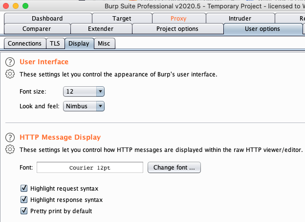
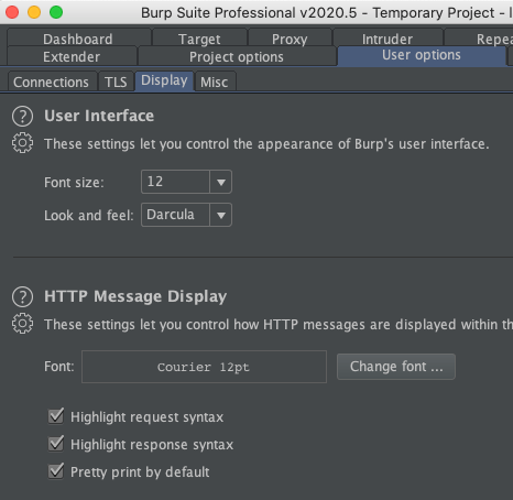
One of the ‘Look and feel’ options is a dark mode type of operation. The available themes do allow offer a high contrast view within the application. However, none of these options allow you to fully customize for a specific high contract mode with certain colors or to change any colors.
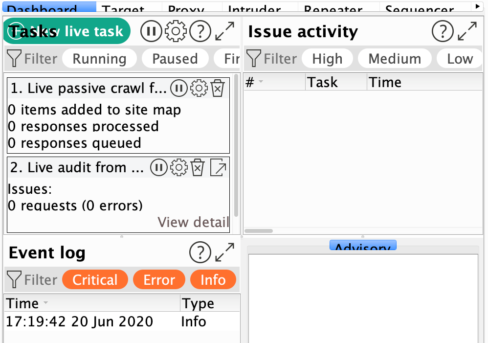
n some cases, the scale up of text doesn’t work very well or at all. For example, moving the font size to a larger font breaks some of the functionality, squishing together text tabs and cutting off text in certain situations:
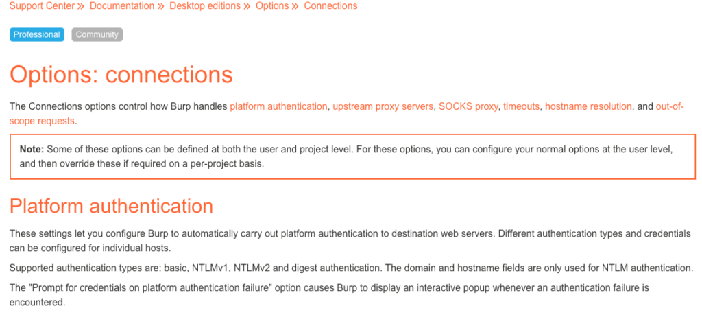
The help file uses the built-in browser within Burp to display content. However, this browser does not allow for zoom, color, or other adjustments normally available to other fully featured browsers. The following is a screenshot after the Burp text size has been adjusted to a 36-point size but not successfully applied to the help screen.
When Burp responds with the severity ratings of specific findings, it does so with both a color and a text description of the rating severity. This is good!
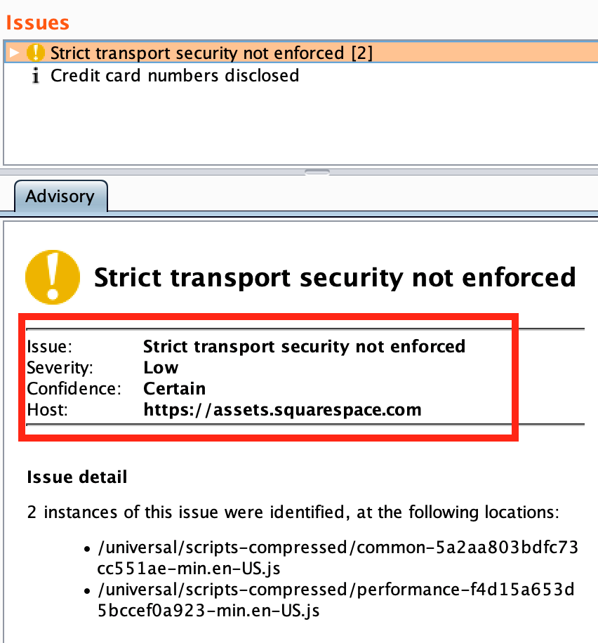
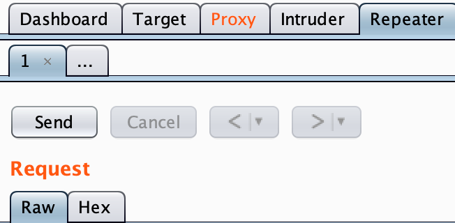
When the application has a notification in a different tab, it changes the color of the text to orange. Regarding color blindness, this makes it difficult to distinguish a change as only the brightness of the text is different. A small symbol or boldness change might be good to help distinguish alerts.
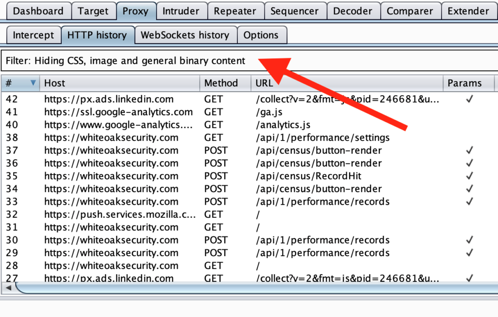
When using the Proxy or Target features, there is some text that lists the ‘Filter: xyz’ within a large white box towards the top of the screen. I’m not sure about you, but I would not have known that this was a box was a drop down until it was specifically shown to me. An option to have an arrow or some standard method of notifying the user this is a drop-down box would help assist the user find this functionality.
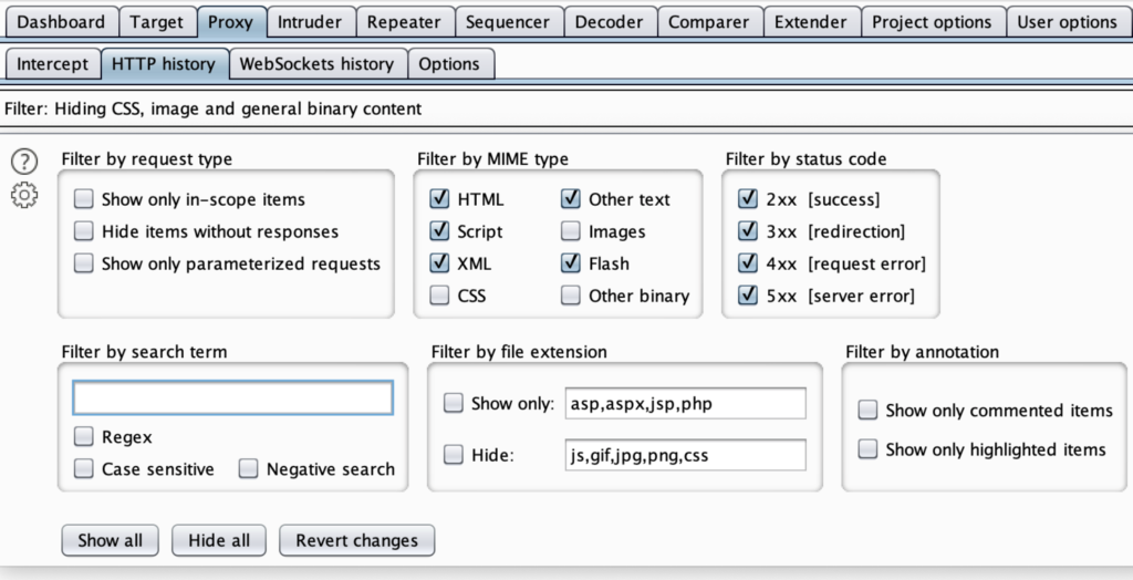
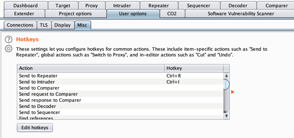
Burp Suite includes several keyboard shortcuts for switching between multiple tabs and performing some functionality. In addition, many of these can be configurable by the user. To access this, go to User options > Misc > Hotkeys.
Passionfruit
Passionfruit is an iOS mobile app blackbox assessment tool. The web interface runs in any modern web browser. You can take a look for yourself at https://github.com/chaitin/passionfruit.
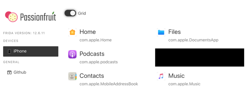
The initial web interface is well spaced, separating the device list from the application grid list. The text is large for the important files and the app icon is the same as the one used on the phone. The screen is also responsive to screen size adjustment, text size changes, and allows for keyboard only use.
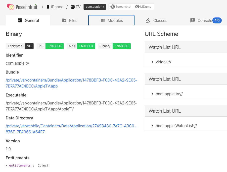
When logged into a specific app for testing, each section is laid out with clear labels, boxes, and well contrasted items. The colors for each of the Binary checks (green and black) are matched with the appropriate word for the status. The Console has a blue alert box with a number inside, indicating there are additional alert items within that tab. When navigating each section, all links are keyboard accessible using the Tab and Enter keys. Finally, we are able to tell which items are interactive by the use of browser hyperlinks (controlled by the browser accessibility controls). Overall, I am impressed with the accessibility of this application.
Ways To Improve Accessibility
There are several resources that developers can use to improve the accessibility of their websites and programs.
- The W3 Consortium curates a list of accessibility tools that may assist for a wide range of testing needs – https://www.w3.org/WAI/ER/tools/
- If you’re running a web application, the open-source AATT (Automated Accessibility Testing Tool) from PayPal can automatically check against the Web Content Accessibility Guidelines. – https://github.com/paypal/AATT
- The Department of Homeland Security also publishes a tool and guidance for automated website accessibility testing – https://www.dhs.gov/news/2018/07/13/trusted-tester-v5-testing-tools
A Small Call To Action
I do not pretend to be an expert when it comes to the ranges of potential accessibility issues out there. However, there are many resources and stories to hear that allow us to learn from other’s experiences! If we can improve accessibility within our security tools that we share back to the community, we can ensure that everyone has a chance to improve the security posture of every device, website, and program that we touch.
